Designing a banknote for the UK’s largest local currency
Bristol Pound illustration
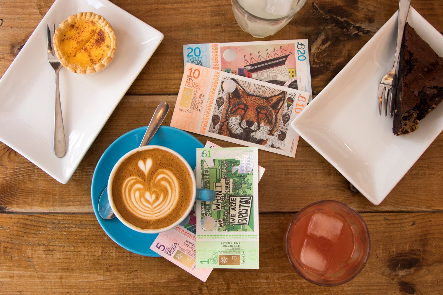
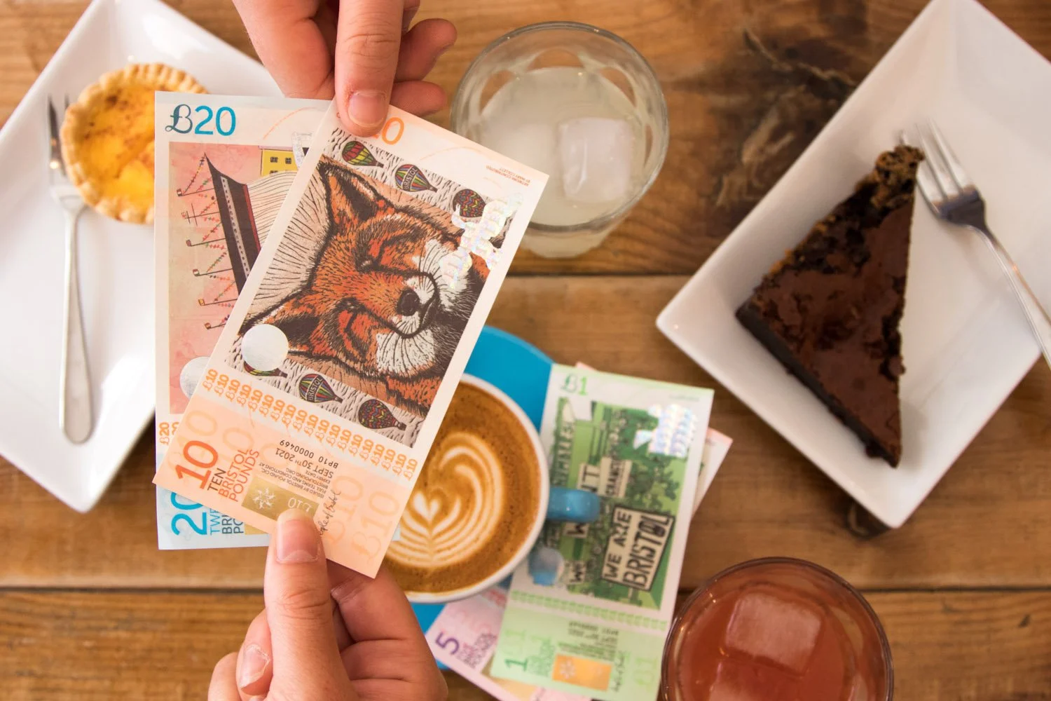
I was elated to be one of the winners of the Bristol Pound 2018 design competition: my design has been printed on all £B20 Bristol Pound's banknotes and circulated through Bristol for years.
In the illustration, the SS Great Britain is elevated in the sky by a delicate wave, almost floating, ready for new adventures. I used the water as a medium to tell the story of the ship, with the aid of words. The sky is pink/red, from the saying “Red sky at night, sailor’s delight. Red sky in morning, sailor’s warning”. I’d like the viewer to decide what that means for them.
The judges loved the contemporary ideas in this design. They agreed that the SS Great Britain elevated into the sky is a powerful image and the writing in the water is a lovely effect.

Press
Bristol Post – Design Winners Announced For City's New Notes
Bristol Pound – Winners Announced
Bristol Pound – Meet the Artists: Kiwani Dolean
Bristol Pound – Meet the new Bristol Pounds
Business Live – Bristol Pound: City currency initiative offers interest-free loans to boost local businesses
La Stampa – Il disegno di una giovane di Sarre scelto per la Sterlina di Bristol (IT)
Aostasera – Una digital designer dietro al nuovo volto dei Bristol Pound, la moneta fatta in casa (IT)
Meseconomia – El Bristol Pound presenta els dissenys dels seus nous bitllets (ES)


The time-lapse of the Bristol Pound illustration
The Artistic Process
I started with some research on the theme to get some inspiration, exploring Bristol's maritime history and locations. I then sketched a few ideas and concepts, choosing the SS Great Britain as my subject – the ship had a special meaning for me, as I saw it for the first time shortly after moving to Bristol and was deeply fascinated by it.
Once I was happy with my paper sketches, I worked on my illustration on Procreate. The artwork took about 2-3 hours – it was an organic process as I was experimenting with textures and colours until the end, and I greatly enjoyed it.